Rock & Brews Restaurant Marketing & Branding
Restaurant marketing is both an art and a science. It requires among other things a generous mix of market research, positioning and branding. One of the hallmarks of good branding is the consistent use of visual assets to communicate a company’s core mission. A strong brand is one that has successfully aligned that mission with its execution.
Rock & Brews is an energized dining concept offering affordable, quality American comfort food and an amazing selection of 52 craft brews on tap, while immersing guests in a family-friendly rock ‘n’ roll experience. It was important that in-store restaurant items not only visually matched the rest of the branding but also conveyed the same vibe.
Restaurant marketing started with a promise
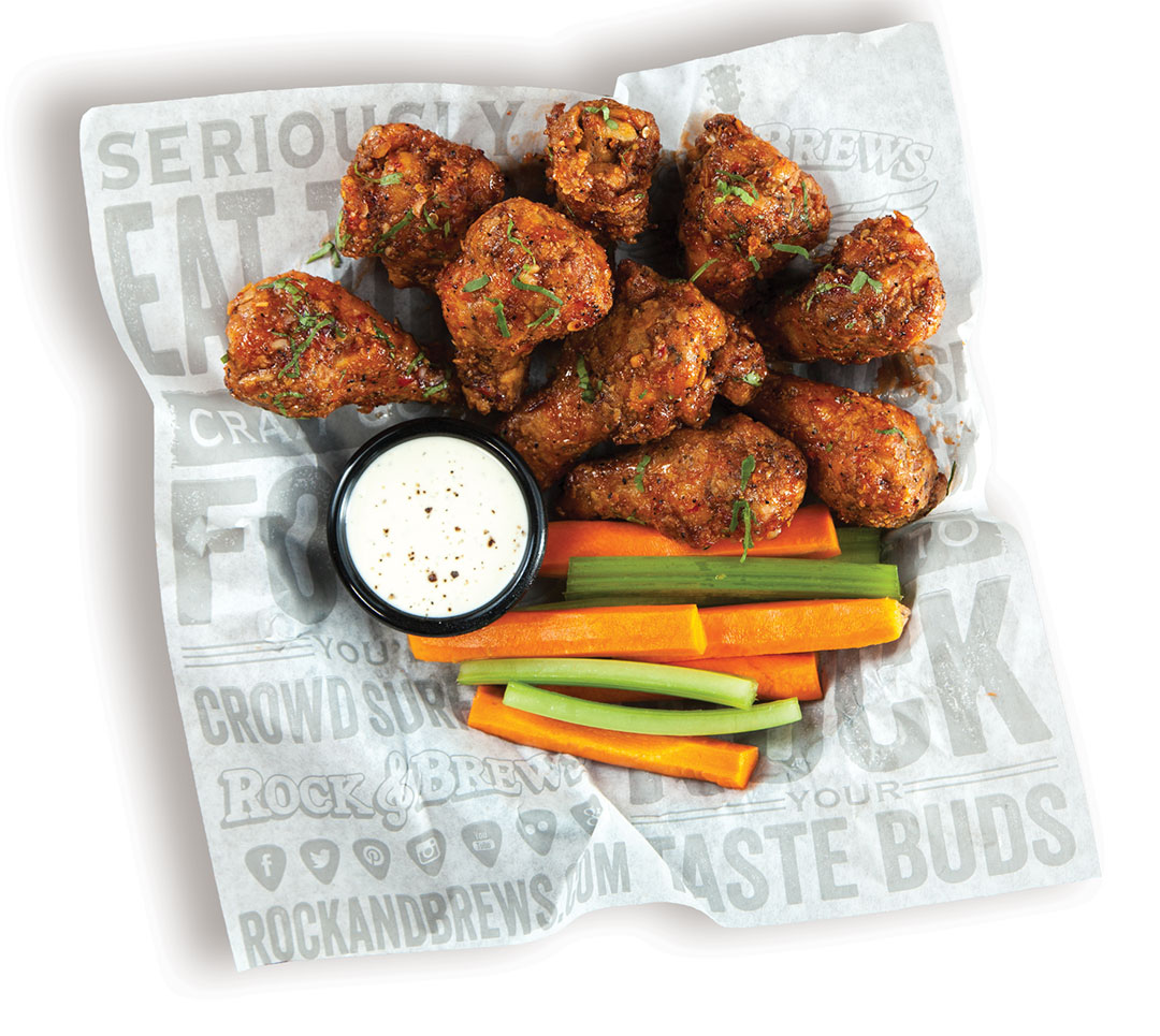
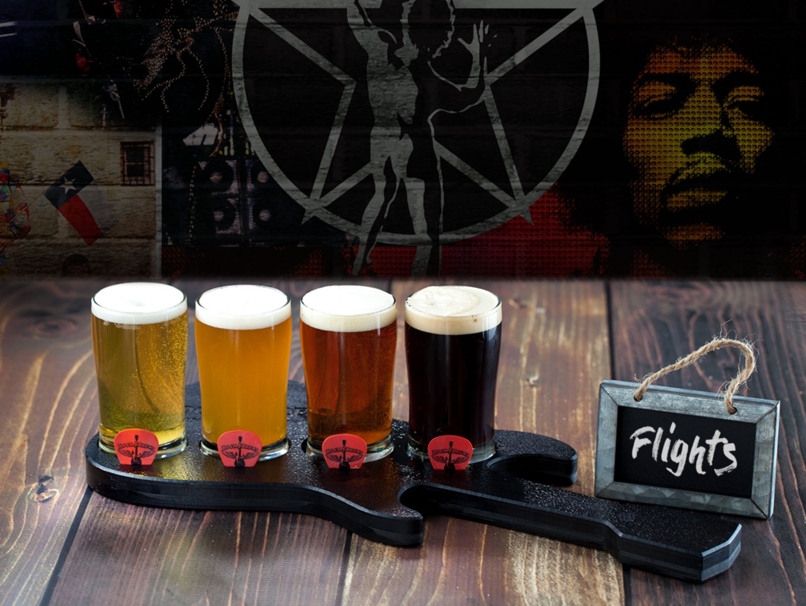
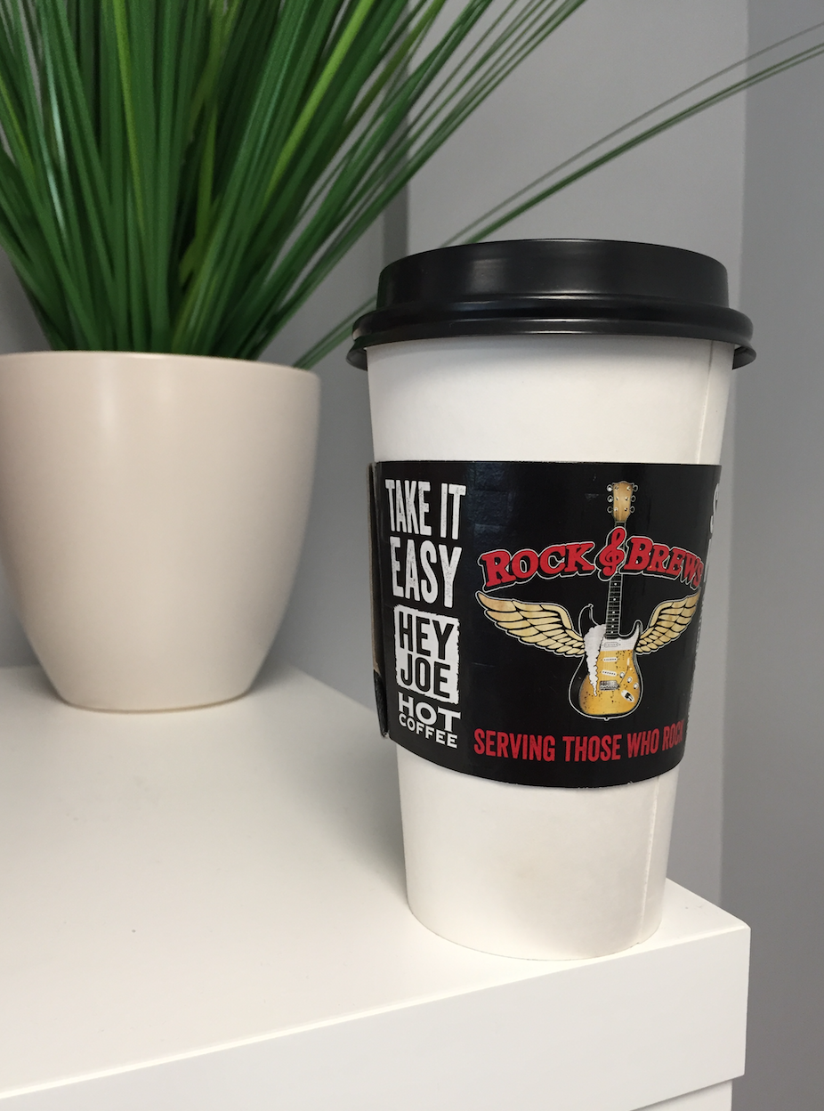
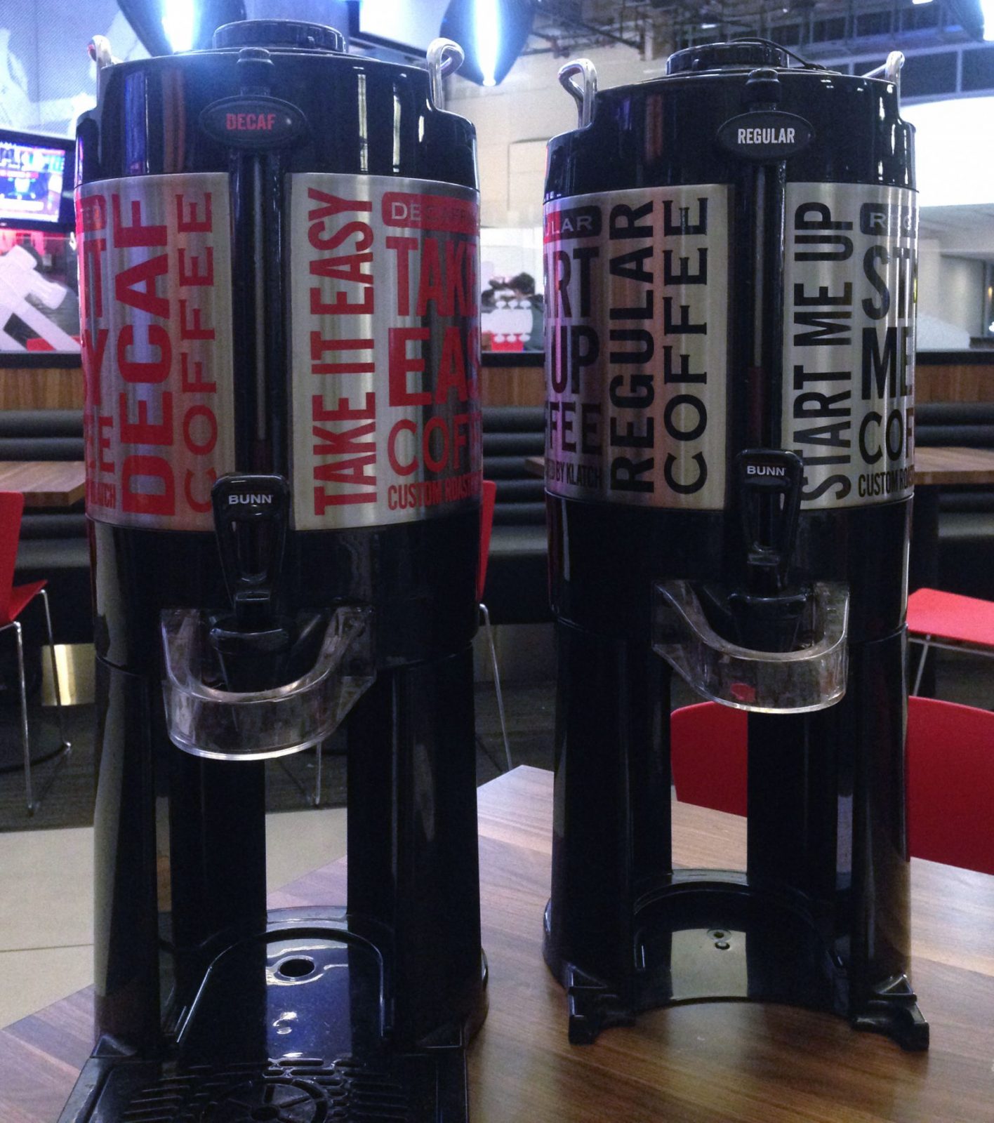
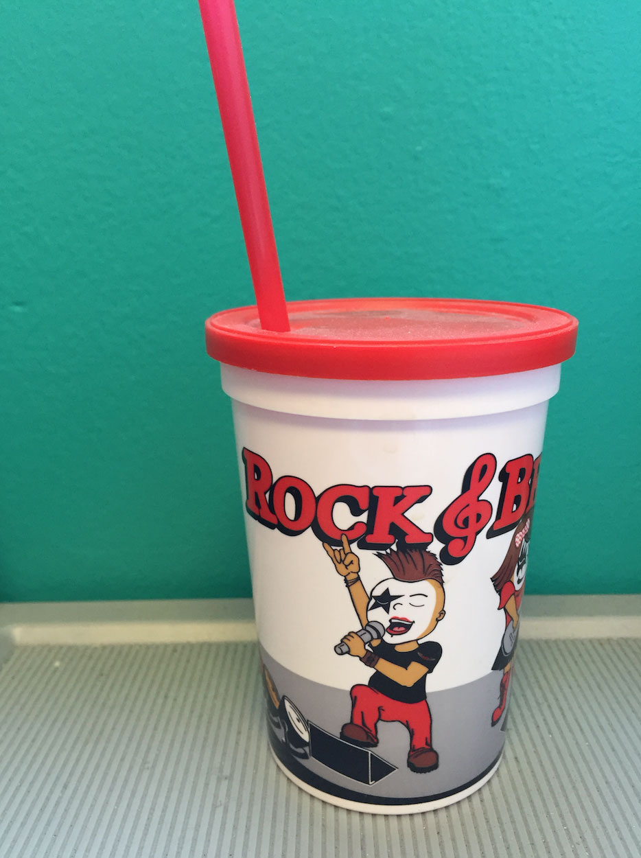
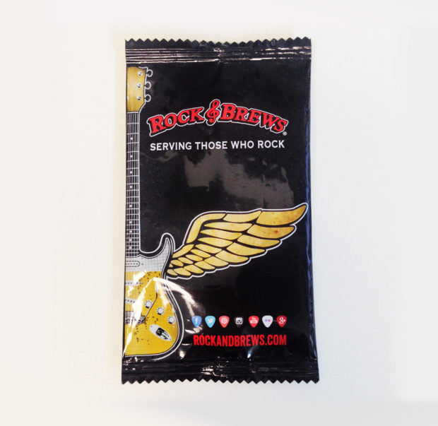
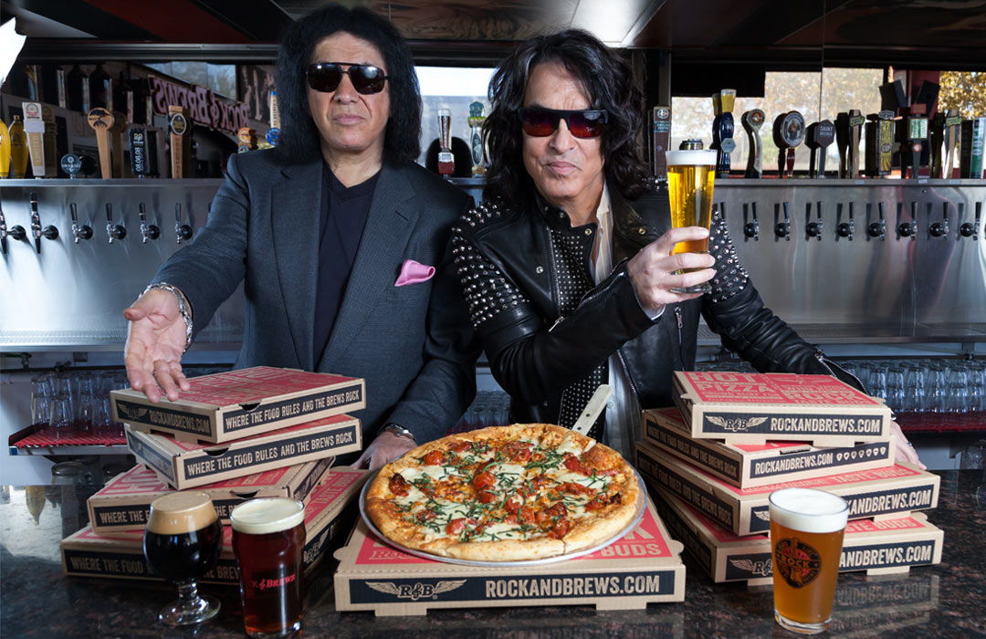
Our design of the Pizza Boxes, Coffee Urns & Sleeves, Wax Paper basket liners, Guitar Flights, Kid’s Cup and Moist Towelette packages began with a promise. We started with the brand’s fundamental love of concert rock and sharing good food with friends. Our strategy culminated in delivering graphically playful restaurant elements that reinforced the brand experience: casual dining in an entertaining, iconic setting.
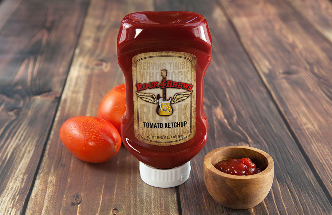
When Rock & Brews decided to private label their own branded Ketchup, we designed the label to match with the rest of the in-restaurant paper goods. We managed the entire restaurant marketing project from concept and design through pre-press production and printing.
We were ecstatic with the results and we know restaurant guests love the designs too because images show up all over social media!
