Center Stage Box Office Ticketing | Website Redesign
Two compelling reasons to redesign a web site are: your business has outgrown the current site or your current site is not growing your business. Fortunately for Center Stage, creators of one of the leading mid- to enterprise level box office ticketing solutions, it was the former.
Founded in 1985 Center Stage started with a simple IBM XT and programmed it out of necessity to keep track of its accounting services. As one of the oldest and most trusted companies in the field of box office ticketing, their flagship Wintix and Webtix systems have been rated among the top preferred box office software programs, according to Technology in the Arts of Carnegie Mellon University.
Center Stage Software powers small and large venues across the country. In addition to its ability to handle the busiest box office, it can also handle fundraising, patron management, volunteer sales and much more. Its ease of use and customizability are supported by a deep commitment to individualized customer service.
With record-breaking numbers on what the system can handle, Center Stage box office accounting system have accommodated more than 30 users at once and sold 310,000 tickets with transactions of over $10M in one day.
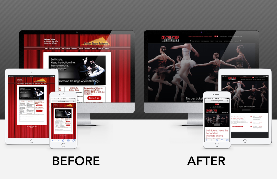
By 2015 Wintix sales had outpaced their current web site and it was starting to show. Its current platform was not responsive and was difficult to update. The last redesign was two Presidents ago. It was time for a refresh!
The key goals for this redesign project were:
- improved navigation
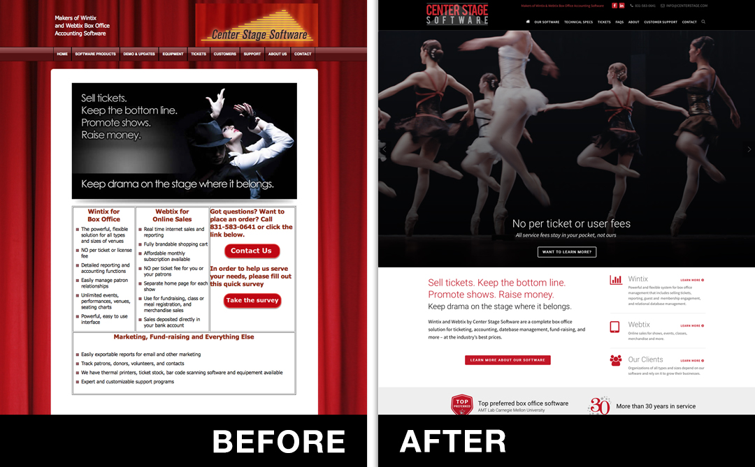
- updated visuals that were modern and on-brand
- improved speed and performance
- responsive design that adapted well from desktop to mobile
- ease of content update
- update branding with a new and improved logo design
A web site redesign can seem exhilarating at first because we get to creatively apply all the knowledge we’ve acquired over our twenty years of experience to tackle a host of tough business problems. A redesign can be even more challenging than developing a new site because you often times must work with existing branding and content. It requires a different mindset.
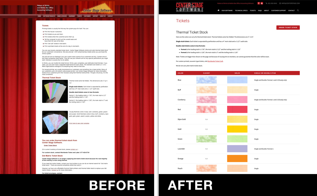
One way to make the task less daunting is to have a clear redesign strategy that focuses on solving issues. For this project, we divided the game plan into workable chunks: planning, preparation (site audit), development, pre-roll and launch. One of the most difficult parts of the project was reworking the navigation and content sections into a more intuitive user interface.
We are very pleased with the end result, and certain this re-design will elevate our client’s online conversion rate onboarding new venues and organizations.

